YouTube Vlog Thumbnail Strategies That Get Clicks


Your vlog thumbnail is your first and often only chance to convince someone to watch your video. It's a visual promise that needs to stop scrollers mid-feed and make them click.
The most powerful vlog thumbnails work because they create an unresolved question in the viewer's mind. Rather than showing everything, they hint at something intriguing just out of frame or tease a story that begs to be discovered. This curiosity gap is what transforms passive scrollers into active viewers.
Think of your thumbnail as a movie poster for a 10-minute story. It should suggest drama, transformation, or revelation without giving away the ending.
Emotional Engagement: Your Face Is Your Hook
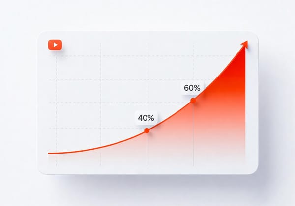
Close-up faces with clear, relevant emotions are non-negotiable for vlog thumbnails. Our own research shows that thumbnails featuring genuine emotional expressions can boost click-through rates by up to 43%. But here's the key: the emotion must match your content's tone and create intrigue.
A shocked expression works when something unexpected happened. An excited smile signals fun and positivity. A concerned look hints at challenges overcome. Your face should fill 25-40% of the frame, positioned slightly off-center (often on the left third), and be noticeably brighter than the background.
Body language amplifies this effect. Open, confident poses with arms outstretched convey excitement. A tilted head with a gentle smile feels intimate and inviting. Even subtle gestures like a raised eyebrow, a pointing finger, add layers of intrigue that make viewers wonder: What's happening here?
Visual Storytelling: Context Clues That Compel
Props, background elements, and setting details instantly communicate what your vlog is about. A backpack suggests travel. A whisk implies cooking. A camera hints at behind-the-scenes content.
For transformation vlogs, the before-and-after split-screen is incredibly powerful. For a van -living story, consider showing an empty van versus the finished interior conversion, creating a visual story arc that promised a satisfying journey. The thumbnail itself became a mini-narrative.
The crucial element is to to leave something unresolved. Crop out revealing details. Pose questions visually. Show enough to spark curiosity but not enough to satisfy it. This curiosity gap is what drives clicks, viewers need to watch to close the loop you've opened.
Text Overlays: Short, Punchy, Never Boring
Here's where most vloggers go wrong: they either skip text entirely or repeat their video title verbatim. Both are missed opportunities.
Effective thumbnail text should be 2-5 words maximum: a mini headline or emotional exclamation that complements (not duplicates) your title. Pair a shocked face with "I CAN'T BELIEVE IT!" or a travel scene with "WORST DECISION EVER?"
The key is avoiding purely declarative statements. Don't write "My Morning Routine" when your title already says that. Instead, try "5AM MADNESS" or "THIS CHANGED EVERYTHING." Make it emotionally charged or question-inducing.
Use thick sans-serif fonts with strong outlines or shadows for contrast. Test readability at phone size. If you can't read it on a small screen, neither can your viewers. And position text away from YouTube's timestamp and duration overlays (typically bottom-right corner).
In our experience, thumbnails with 2-3 descriptive words see 15-25% higher CTR than those with no text or excessive text. Though there are specific styles that can work without text too, it is much harder to make that work.
Color, Contrast & Composition Essentials
Bold, high-contrast color palettes cut through the visual noise of crowded feeds. Yellow and black, red and white, bright blues against warm tones—these combinations command attention. But they should also align with your niche: blues and greens signal outdoor/travel content, while pinks and purples often suit beauty or lifestyle vlogs.
Your main subject (especially faces) must pop from the background through brightness, saturation, or both. Follow the rule of thirds compositionally, placing your face or key object off-center creates dynamic tension that draws the eye.
Most importantly: keep it simple. One (or at most two) dominant element, one clear background, minimal text. Cluttered thumbnails perform significantly worse than focused ones. If you're including a logo for branding, make it subtle and small.
Building Your Visual Brand
Consistency builds recognition. When viewers can identify your content at a glance, they're more likely to click. Use the same color schemes, fonts, and overlay styles across your thumbnails. This doesn't mean every thumbnail looks identical, it just means they feel like they belong to the same creator.
For video series or recurring formats, create visual continuity. Use episode numbers, consistent borders, or recurring graphic elements so viewers immediately understand these videos are connected. This visual consistency can increase subscriber conversion by 20-30%.
You can still adapt to seasons or trends (adding holiday elements or the year like "2026" stamps), but do so within your core aesthetic framework.
Mobile-First Technical Requirements
Around 70% of YouTube watch time happens on mobile devices, which means your thumbnail needs to work at the size of a postage stamp. Always preview thumbnails small before publishing.
Use YouTube's recommended 1280×720px resolution (16:9 ratio) and keep files under 2MB. Start with sharp, high-resolution source images as blurry photos strongly discourage clicks. Check that critical elements aren't hidden by YouTube's UI overlays like timestamps or buttons.
Test your thumbnails against both light and dark mode backgrounds, as YouTube supports both viewing modes.
Testing and Optimization
The best vloggers treat thumbnail creation as an ongoing experiment. Track your click-through rates in YouTube Studio and compare similar videos with different thumbnail approaches. What patterns emerge? Which facial expressions, colors, or compositions consistently perform better?
While A/B testing (if you have a big enough audience) different designs can provide valuable insights, getting objective feedback before publishing saves time. Tools that analyze thumbnail clickability can predict performance potential and identify specific improvement areas, from lighting and camera angle to color choices and text placement.
BerryViral offers exactly this kind of intelligence: objective clickability ratings, specific actionable feedback on what to improve, and the ability to generate optimized thumbnail variations that maintain your style. It can even analyze your video file to suggest fresh thumbnail concepts you might not have considered. Think of it as having a thumbnail strategist who's studied thousands of viral videos, available whenever you need guidance.
The Bottom Line
Effective vlog thumbnails aren't a game of trickery, they're about honest intrigue. Create genuine curiosity. Show authentic emotion. Give visual context. And always, always leave viewers with an unresolved question that only watching your video can answer.
Your thumbnail is the handshake that starts a conversation with potential viewers. Make it confident, clear, and impossible to ignore.