BerryViral Rating
4.1
Needs improvement. Check the feedback for key fixes.
Why It Doesn't Work
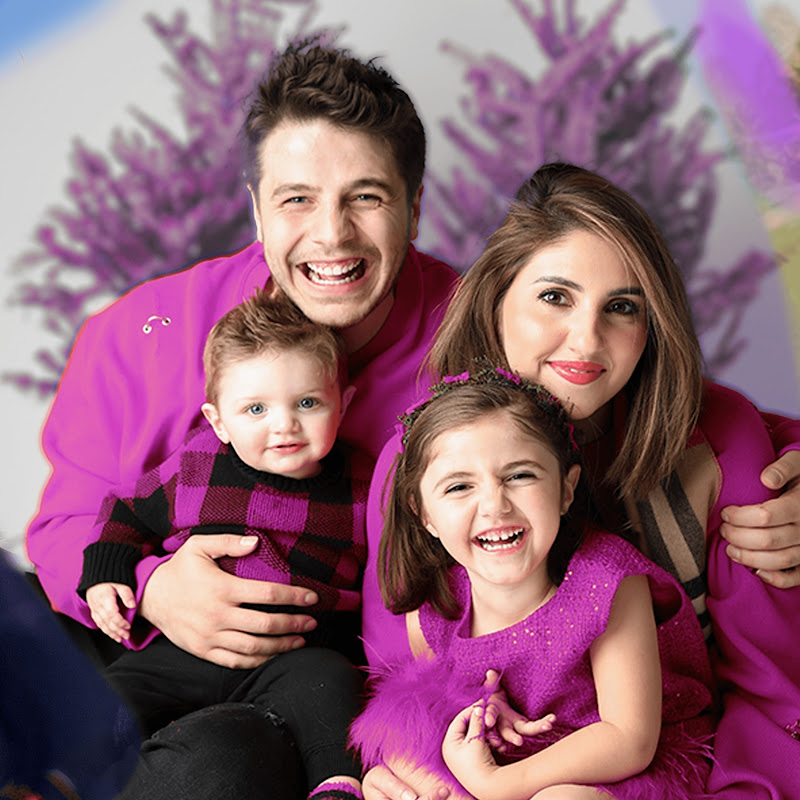
- The thumbnail is too generic and doesn't create any intrigue or curiosity.
- The 'WELCOME HOME' sign text is small and hard to read on mobile devices.
- The composition is cluttered with too many people and background details.
- The image lacks visual contrast and doesn't stand out against other thumbnails.
- The thumbnail doesn't effectively showcase the 'New House' mentioned in the title.
Want to analyze your own thumbnails?
Try BerryViral for Free