How to Create a YouTube Thumbnail That Actually Gets Clicks

Why your thumbnail is your most important asset
You can make the best video on YouTube, but if your thumbnail looks like a five-minute rush job, nobody clicks. It is your storefront. It is your first impression and a visual hook that stops people mid-scroll.
Most clicks come from thumbnails. Since the average viewer decides in under a second, you don't get a do-over.
Get the technical specs right
If you mess up the technical side, your thumbnail looks blurry or cropped. That kills your click-through rate before a viewer even reads your title. According to industry best practices, keep these specs in mind:
- Size: 1280 x 720 pixels
- Aspect ratio: 16:9
- Max file size: 2MB
- Formats: JPG, PNG, GIF
1280x720 is the sweet spot. It stays sharp on desktops and TVs without hitting that 2MB limit. Always design at this resolution, but check how it looks when shrunk down to 168x94 pixels. If your text is unreadable on a phone, you have a problem.
What high-performing thumbnails look like
vidIQ's 2026 study of 500 breakout videos found that the winners usually shared a few traits:
- Faces: 69% featured a human face.
- Contrast: 89% used high-contrast colors.
- Brevity: Three to five words of text, max.
- Focus: One clear focal point.
Humans are wired to look at faces. Use a real expression—shock, curiosity, or excitement—to grab attention. High-contrast colors help your thumbnail stand out against the sea of other videos.
The five elements that drive clicks
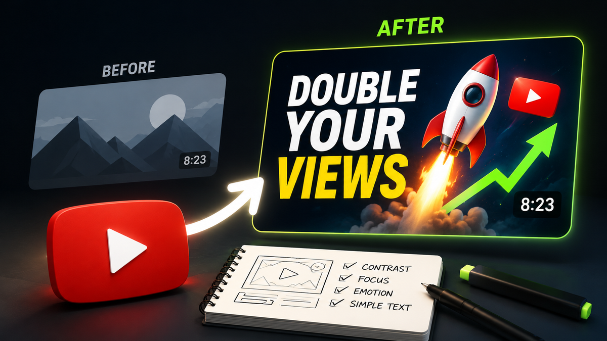
1. One clear focal point: Don't cram in three faces, a logo, and a paragraph of text. Pick one hero element. If you squint and can't tell what the video is about, it is too busy.
2. Expressive faces: A neutral headshot is a waste of space. Use an expression that matches the video's emotion. If you aren't on camera, use bold graphics to do the heavy lifting.
3. High-contrast colors: Use complementary colors like blue and orange or yellow and violet. Avoid YouTube’s native red, white, and black, or your thumbnail will blend into the UI.
4. Bold, minimal text: Keep it under five words. Use a thick, sans-serif font with a drop shadow. If you can’t read it at arm's length on your phone, it is too small.
5. Channel consistency: Use the same fonts and brand colors across your uploads. This builds recognition so returning viewers spot your content instantly.
Common mistakes to avoid
- Misleading clickbait: If your thumbnail promises something the video doesn't deliver, viewers leave immediately. The algorithm notices this and stops recommending your content.
- Blurry images: Pixelated thumbnails look low-effort. Always use high-quality source files.
- Ignoring mobile: Over 70% of views happen on phones. Design for the small screen first.
- Copying others: Inspiration is fine, but don't clone a layout so closely that you lose your own brand identity.
Free tools to build your thumbnails
You don't need expensive software to look professional.
- Canva: Good for templates and quick drag-and-drop design.
- Adobe Express: A clean, polished alternative with great stock photo access.
- Picsart: Useful if you need to composite images or remove backgrounds.
The step most creators skip
Designing a thumbnail is one skill; knowing if it will get clicks is another. You can follow every rule and still miss the mark because of subtle issues like poor lighting or low contrast.
This is where BerryViral helps. Instead of guessing, you upload your thumbnail to get a clickability score and specific detailed feedback. It tells you why a design might fail and can even generate improved versions for you.
How to A/B test
If you have access to YouTube’s A/B testing feature, use it to refine your strategy:
- Change one variable at a time: If you swap the text, colors, and face all at once, you won't know which change worked.
- Give it time: Run tests for at least a week to get real data.
- Track your wins: Keep a simple list of what works for your audience.
Growing a channel isn't about one lucky viral hit. Treat your thumbnails like a system: test, learn, and get better every time you hit publish.