The Best Colors for YouTube Thumbnails: A Data-Driven Guide to Boosting CTR

Your thumbnail has roughly 1.5 seconds to stop a scroll. Get the color wrong, and you've lost the click, no matter how good your video is.
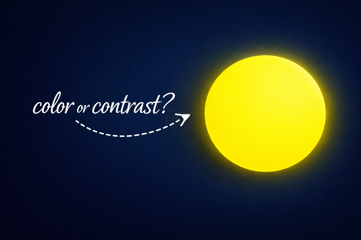
There's no single "magic" color that works everywhere. What matters is contrast, context, and limiting your palette. Red and yellow grab attention, blue feels safe, green feels positive. But the key is contrast, not one special color.
This guide walks through how to pick thumbnail colors that actually convert: based on color theory, psychology, and what's working in the wild right now.
Why Contrast Beats "Best Color" Every Time
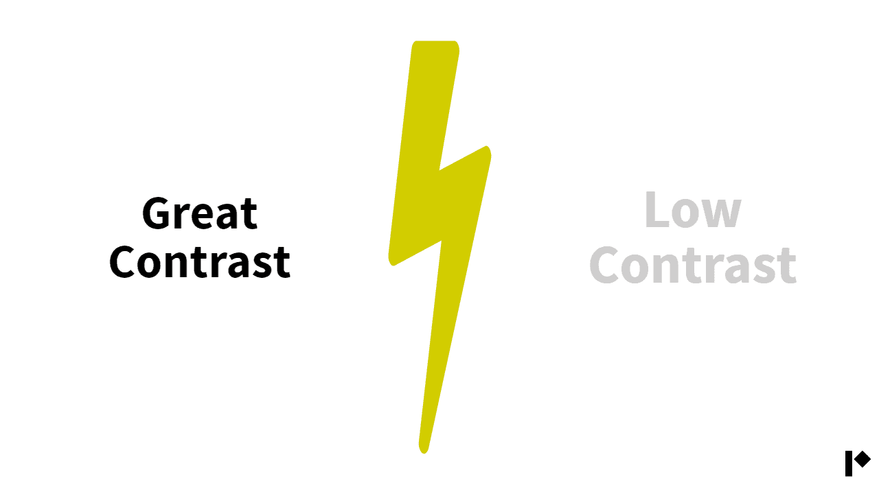
Before you worry about red vs. blue, nail the fundamentals: light against dark.
A bright subject on a dark background (or the reverse) creates instant visual separation. Light text on a dark field, or vice versa, makes text readable even on mobile. More importantly, it helps your thumbnail pop in YouTube's feed.
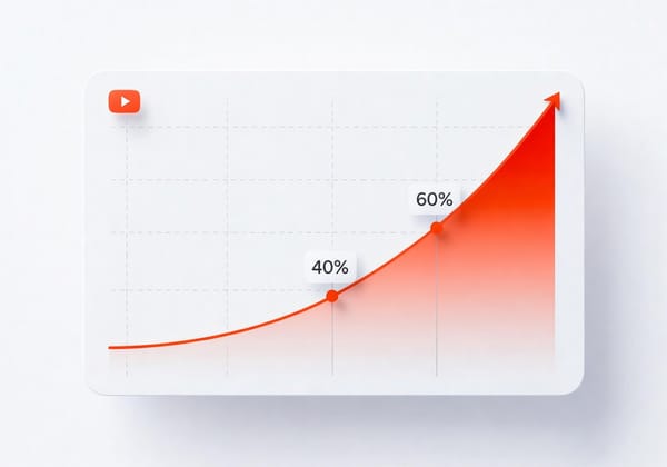
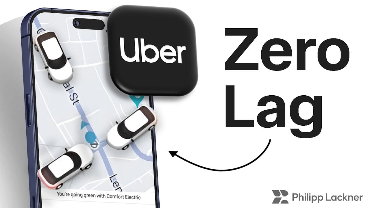
Here's where it gets interesting: YouTube's default interface is bright white. That means dark thumbnails with bright accents can achieve roughly 70% higher CTR than light ones, simply because they create "reverse contrast" against the page. Your thumbnail literally glows in the feed.
The flip side: if your audience uses dark mode, make sure you've got bright borders or elements so your thumbnail doesn't disappear into the UI.
Color Theory Crash Course (Just What You Need)
You don't need a design degree, but understanding a few basics helps.
The color wheel has primary colors (red, blue, yellow), secondary (orange, green, purple), and tertiary mixes. Using complementary colors (opposites on the wheel) creates natural tension that makes each hue pop harder. Think red vs. green, or blue vs. orange.
Triadic schemes (three colors evenly spaced, like red-yellow-blue) give you balance.
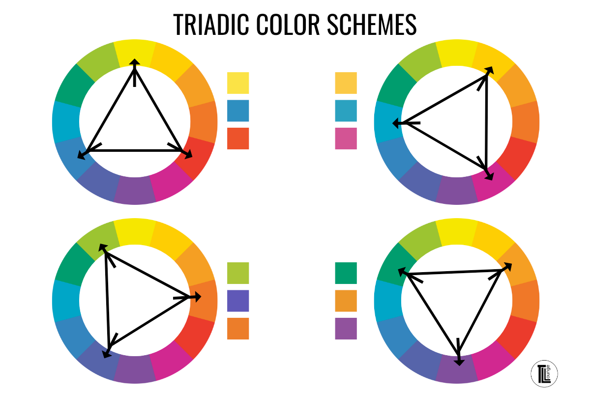
Monochromatic palettes use shades of one color for a cleaner, more unified look.
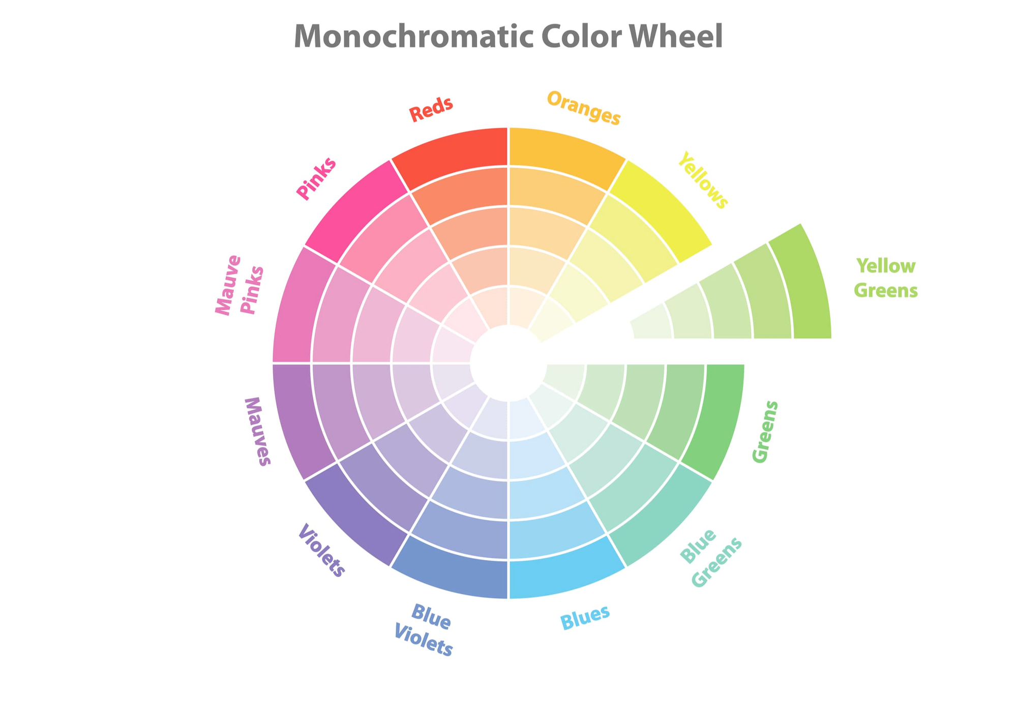
But here's the rule that matters most: stick to 2–3 colors. More than that and you get chaos. One guide warns bluntly: "too many colors = chaos"—your eye doesn't know where to land, so viewers keep scrolling.
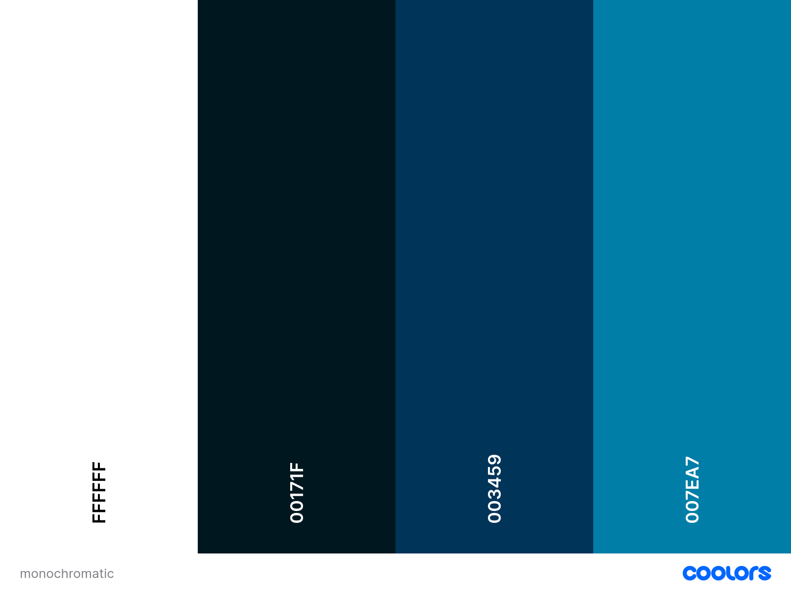
Use a color scheme generator like coolors. They can generate random color palettes, help you pick colors from existing images, and inspire you with their extensive collection of palettes. Like so:
What Each Color Actually Communicates
Colors carry meaning.
- Red triggers urgency and excitement.
- Yellow grabs attention and feels upbeat.
- Blue signals trust and calm.
- Green suggests growth or balance.
- Orange is energetic
- and purple implies creativity or luxury.
Match the emotion to your content.
- Tutorial or finance videos often use blues and greens (calm, reliable).
- Comedy or entertainment leans into yellows and oranges (fun, high-energy).
- Drama or reaction content uses red for emotional punch.
- Luxury or tech reviews go purple or black for sophistication.
What to avoid when selecting colors?
Bright colors work when they're selective. But if you use them everywhere, nothing is clear. Better to keep most parts soft and use strong color only on the main subject.
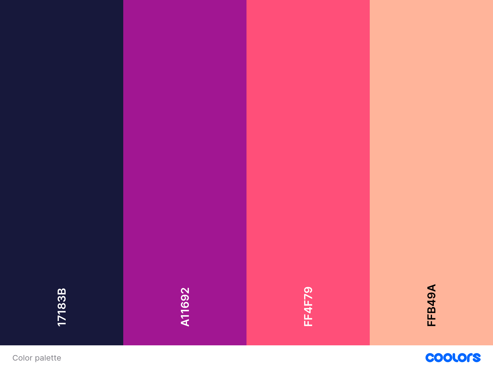
Using 3 bright colors, makes it hard to focus on any one thing in the image below. You can't form any impression within a second or less that you spend on evaluating thumbnails. As a result, you'll most likely skip this video.

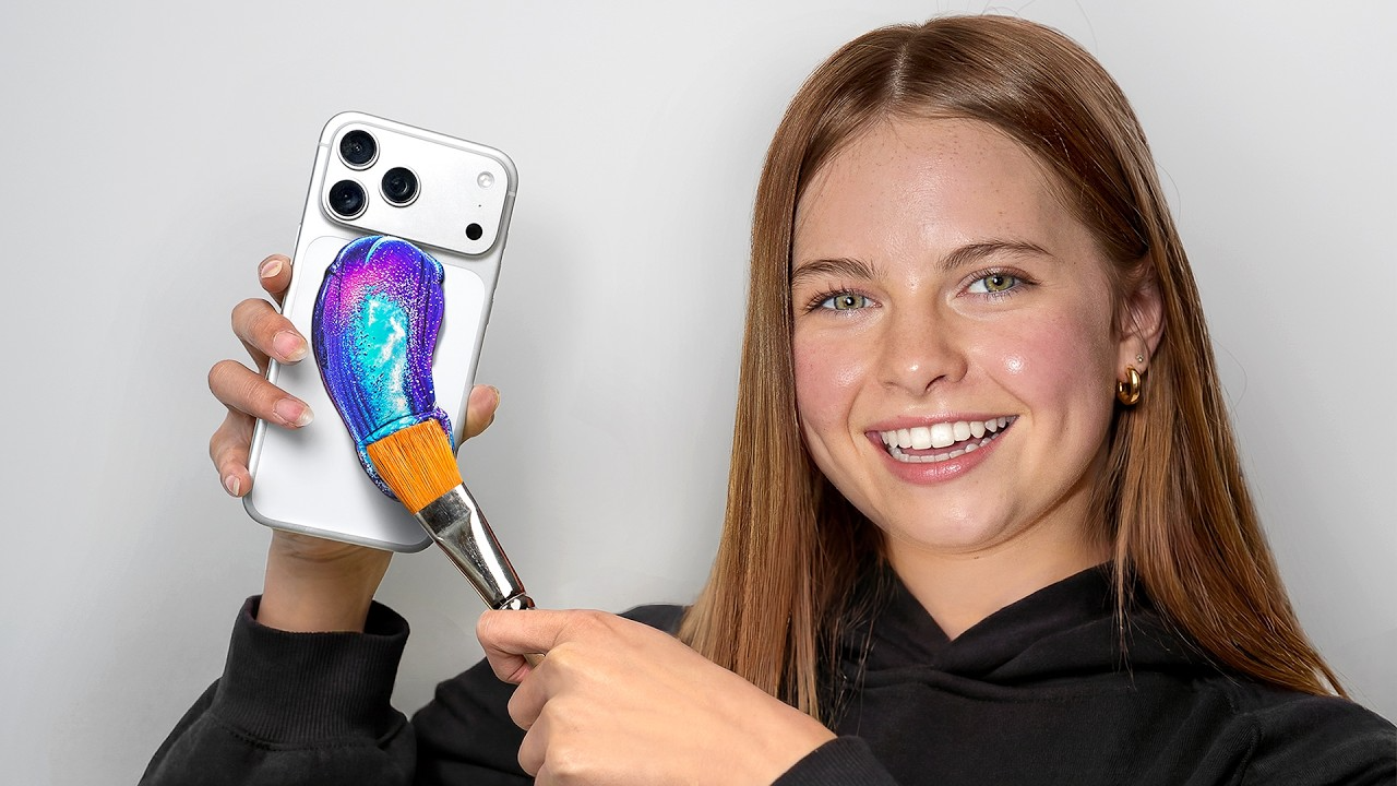
Think of ZHC's thumbnails: neutral background, one neon brushstroke. Your eyes automatically go there first to the saturated element. Everything else stays muted so the accent does its job.
Background Color: Dark or Light?
Neither is objectively better. What works depends on your subject and niche.

Others go the opposite route: white or pale backgrounds with dark subjects and text.
The logic is the same either way—make the important part bright, keep the background simple. A gritty gaming thumbnail might use blacks; a cooking tutorial might use clean white. Just don't let the background fight with your text or face.
Additionally, avoid low-contrast combos which are hard to read, and easy to ignore.
Yellow on white, and vice-versa is another such example.
Background Color: Dark or Light?
Color Schemes by Niche (With Examples)
Different content types have color norms—but that also means opportunities to stand out.
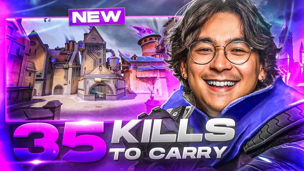
Gaming & Entertainment
Loud, fast, saturated. Gaming thumbnails lean heavily on neon greens, electric blues, and bright reds on dark backgrounds. High saturation creates urgency. For example, a violent game clip might pair neon green with a black scene to make characters "leap off the screen."
Beauty & Fashion
Polished and warm. Beauty creators often use pinks, purples, golds, and pastels. Soft pink or lavender backgrounds with clean white or coral text feel sophisticated.

Education & How-To
Clear and trustworthy. Tutorial channels typically use blues, greens, and white backgrounds, with touches of yellow for emphasis. Blue and green build competence and calm. A clean background keeps the design uncluttered.
Science or explainer thumbnails often use a dark blue-black backdrop with bright white text—maximum clarity, zero distraction. The viewer reads the title instantly.

Tech, Podcasts, Misc.
Sleek and focused. Tech or podcast channels prefer blacks, grays, and blues with one bright accent (orange, red, or green). A black background with a red arrow pointing at a product looks professional but still catches the eye.

Podcast clips (think Joe Rogan highlights, or Diary of a CEO) commonly use a solid color or dark theme with bold text. The face stays legible, the branding stays consistent.
Borders, Outlines, and Accent Tricks
A colored border or outline helps thumbnails "frame" the image and prevents blending into the YouTube UI. It also reinforces branding. If you use the same accent color around each thumbnail, viewers recognize your videos instantly.
When I was thinking of bordered thumbnails, immediately Julie stood out in my head. I didn't even have to think of who it would be. That's the power of border these days. It could potentially get overdone, and that trick may not serve in the longer term. But right now, it can.
Visibility
A subtle glow or drop-shadow around key elements acts like an accent border and makes them pop. Think of it as a spotlight—one bright element on an otherwise soft canvas guides the eye exactly where you want it.
Practical Steps You Can Use Today
- Use high contrast. Bright element on dark background (or reverse). Keep text easy to read with solid backgrounds or text boxes.
- Limit your palette. Stick to 2–3 colors. One dominant, one accent. Anything more looks cluttered.
- Match your niche, then stand out. Look at the top 10 channels in your space. If their thumbnails are all one color, try a contrasting scheme.
- Apply color meaning strategically. Red and yellow for excitement, blue and green for trust. Don't just pick what "looks cool"—pick what reinforces your message.
- Add borders or outlines. A thin border in your brand color (or a glow) helps thumbnails pop and become recognizable.
- Test and iterate. What works for one channel won't work for all. Get your thumbnails tested prior to even uploading the video.
The simplest starting point: "put the main subject bright, and keep the background dark."
Let Data Guide Your Design
You can follow every color theory rule and still miss the mark. That's where objective feedback helps.
BerryViral gives you a clickability score for any thumbnail you upload. No guesswork, just data on what's working and what's not. It highlights specific weak points (low contrast, cluttered palette, unclear focal point) and can generate an optimized version that keeps your style intact while boosting CTR potential.
Think of it as A/B testing before you publish. You get the creative control, but with a second set of eyes trained on what actually drives clicks.
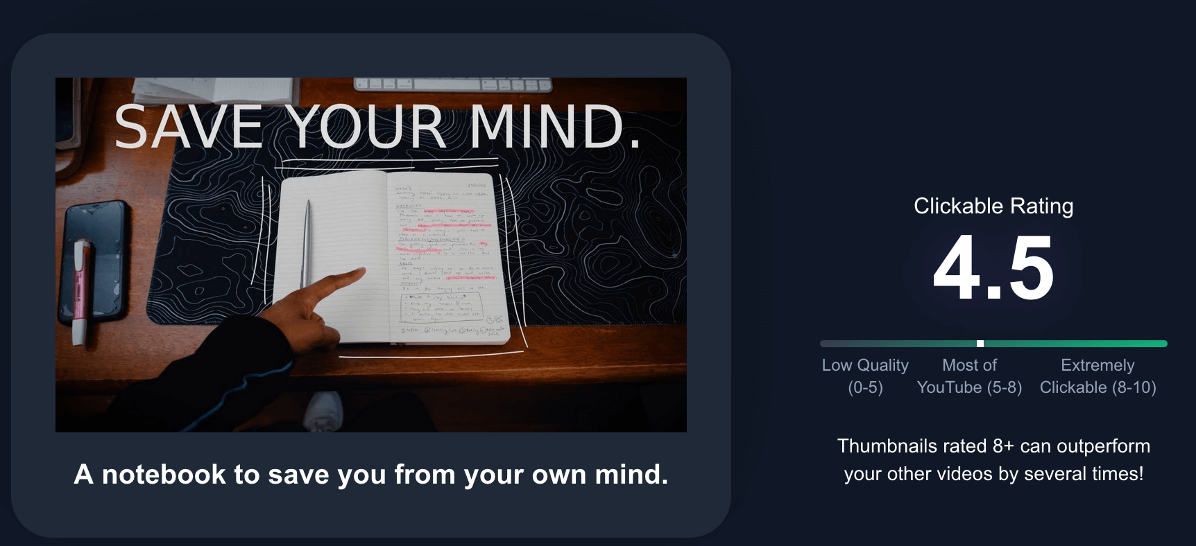
Step 1: Get a rating of the thumbnail you made
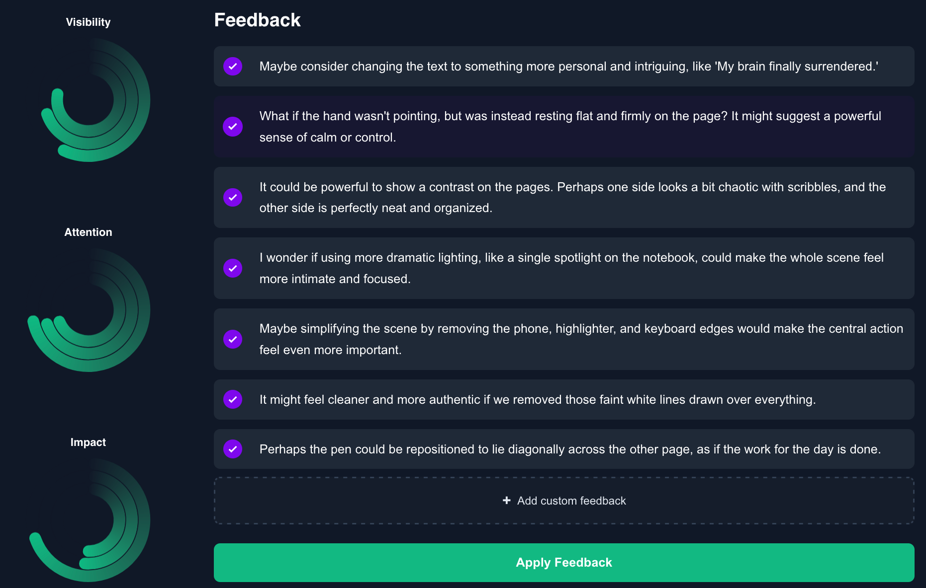
Step 2: Get feedback on your thumbnail to improve it
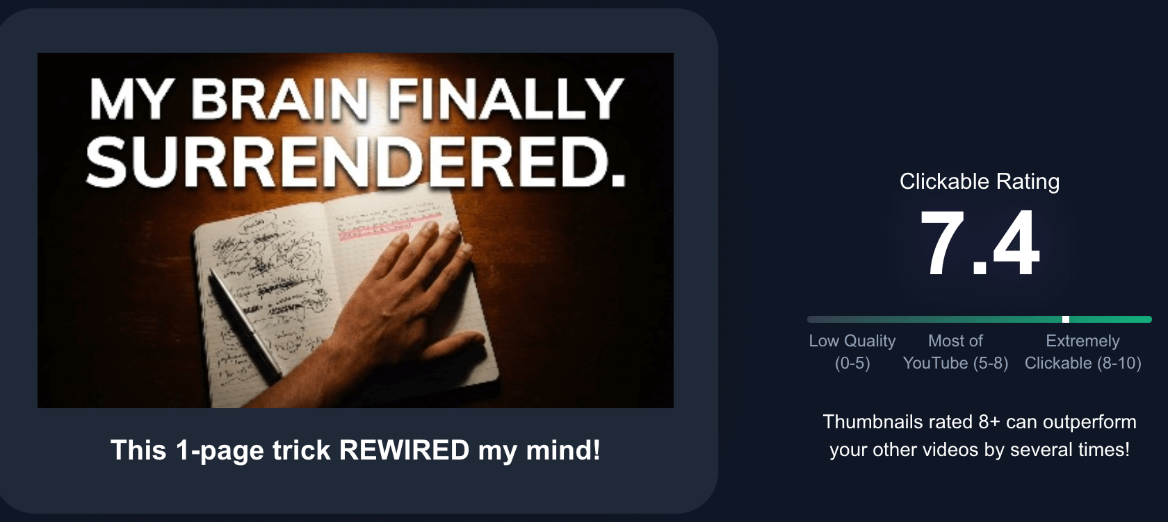
Step 3: Apply that feedback, and get a better rating
Great thumbnail color design sits at the intersection of art and data. Apply color theory (complementary hues, limited palettes) and psychological cues (bright = urgent, cool = calm), while ensuring high contrast and alignment with your brand. When your subject leaps off the background and the colors guide the eye, people click.