YouTube Banner Template: What Actually Makes Viewers Subscribe

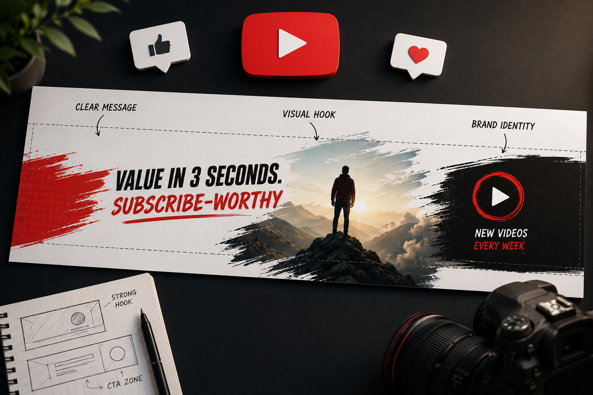
Treat your banner like a landing page
Most creators spend hours on a video but slap a banner together in thirty minutes. Then they wonder why nobody hits subscribe.
People decide to stay or leave the moment they land on your channel, and a sharp, clear banner pulls them toward the subscribe button; a generic one sends them packing.
Get the technical specs right
Mess these up, and your design looks blurry or gets cropped on mobile. According to official design guides, you should follow these standards:
- Full canvas: 2560 × 1440 pixels.
- Safe zone: 1546 × 423 pixels. This is the only part that shows on every device.
- File size: Keep it under 6MB in JPG or PNG.
- Text size: Use at least 30px so it stays readable on a phone.
Keep your channel name, tagline, and key visuals inside the safe zone. Use an overlay tool in Canva or Adobe Express to stay centered. Don't guess.
Your icon is a separate file at 800 × 800 pixels. Keep your subject centered; it renders as a circle.
Answer one question
Visitors land on your page and ask: "What is this, and is it for me?"
Answer that in three seconds. Use a specific tagline of five to eight words. Forget being clever; be clear.
- Personal finance tips for people in their 20s.
- Weekly home cooking tutorials, no fancy equipment.
- Science explained simply, new video every Thursday.
The upload schedule trigger
Most templates skip this, but it is a huge subscription driver. Tell people when you post to remove the guesswork.
"New videos every Tuesday" tells a potential subscriber exactly what they are signing up for and it shows you are consistent.
Visual consistency matters
Your banner and thumbnails should look like they belong together. If your banner is cool blue and your thumbnails are warm orange, your page looks messy. This inconsistency signals that you lack a clear brand identity.
Pick two or three core colors and stick to them. Consistent style makes your channel look professional.
Your icon does heavy lifting
Your icon is tiny, sometimes just 36 × 36 pixels. It must be recognizable at a glance.
- One focal point: A face or a bold logo.
- High contrast: It needs to pop against light and dark backgrounds.
- No text: It becomes unreadable in a circle. Use a symbol instead.
What top channels do differently
Channels like Kurzgesagt and Veritasium didn't get big by accident. They communicate their niche visually. You don't need to read a description to know what they make. Their style, color palette, and tone are locked in across every element of their page.
Common mistakes that kill subscriptions
- Name only: "JohnCreates" tells me nothing. Why should I subscribe?
- Too many calls to action: If you ask for a sub, an Instagram follow, and a Discord join, nobody does any of it. Pick one.
- Mobile failure: If the text is too small to read on a phone, it is useless.
- Filler: Stock photos of landscapes tell the viewer nothing about your content.
Track your progress
After you update your banner, check your YouTube Studio analytics. Look for your channel page's subscriber conversion rate. If that number climbs, your new banner is working.
Use tools like SocialBlade or vidIQ to see how others in your niche handle their branding. If you decide to rebrand, update your name, banner, and icon at the same time so you don't confuse your audience.
The conversion checklist
- Dimensions: Key content is in the 1546 × 423 safe zone.
- Niche: Five to eight words answering what you do.
- Schedule: When do you post?
- Consistency: Colors match your thumbnails.
- Focus: One clear message.
- Mobile: Readable at 30px.
A great banner brings people to your channel, but your thumbnails get them there from search. Get your branding right, and your channel page works for you around the clock. For more on getting your thumbnails right, check BerryViral.com